
Think about a business sign that’s caught your attention lately or stuck in your memory.
Maybe it was the familiar illuminated lettering of a favorite coffee shop or a distinctive sign projecting from a retail store.
That’s the beauty of well-designed signage. It becomes part of how a place is recognized.
An effective sign doesn’t just display a business name. Its style, lighting, placement, and overall design all contribute to how customers perceive the business.
Two popular options, LED channel letter signs and LED pill-shaped light boxes, offer plenty of creative possibilities for making a strong impression.
Both can help a building or storefront stand out, but each brings something different to the table.
Channel Letter Signs: A Little Dimension Goes a Long Way

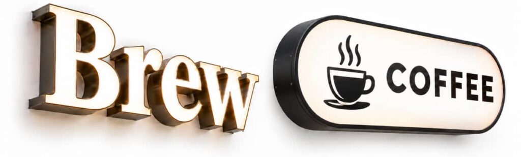
Some of the most recognizable signs feature LED channel letters. Unlike flat signage, these letters have their own three-dimensional structure, typically made with aluminum sides and backs and acrylic faces.
Rather than displaying a name on a single flat panel, each letter has its own structure, extending outward to create depth and visual interest.
Channel letter signage can be customized in many ways, including:
- Fonts and lettering styles that reflect the business’s image
- Colors and finishes that coordinate with its established look
- Graphic elements and logos that complement the lettering
Lighting adds another layer of versatility, with three main options:
Front-lit channel letters illuminate through the face of each letter, giving them a bright, direct presentation that’s easy to see after dark.
Halo-lit channel letters, or reverse-lit letters, cast light onto the wall behind them, surrounding each letter with a soft glow.
Combination-lit channel letters provide illumination from both the front and back, blending the two effects.
The choice often comes down to the setting and desired appearance. For example, a busy ice cream shop might benefit from the bold visibility of front-lit letters, while halo lighting may better suit a professional office or upscale restaurant.
Pill-Shaped Light Box Signs: A Little Curve Appeal

LED light boxes offer another approach to commercial signage, using an illuminated enclosure to display lettering, logos, and graphics together.
Pill-shaped light boxes are one variation with a particularly recognizable shape. Also known as capsule light boxes, stadium-shaped light boxes, or rounded cabinet signs, they feature straight sides with rounded ends.
The curved silhouette offers a refreshing alternative to traditional rectangular designs. Inside the enclosure, LED lighting illuminates a translucent sign face, bringing it to life. This all-in-one concept offers several advantages:
- Unified appearance: Business names, logos, colors, and graphics can be incorporated into a single illuminated display.
- Design flexibility: The enclosed sign face accommodates a variety of typography, layouts, and graphic elements.
- Versatile Styling: Depending on the details, finished signs can take on a sleek, contemporary look, a fun retro feel, or something in between.
And while the name may sound more appropriate for a pharmacy, pill-shaped signs are right at home in all kinds of settings, from boutiques and cafés to salons and bookstores.
Channel Letters or LED Light Boxes: How to Decide Between the Two?
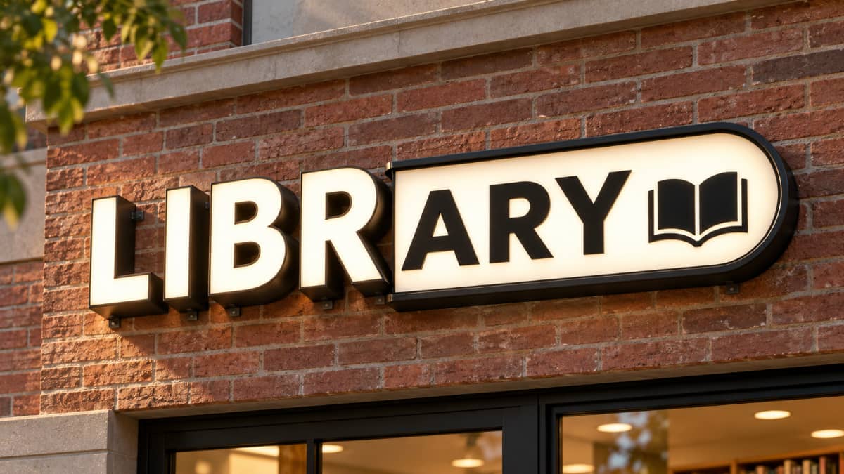
Choosing between the two LED styles involves more than personal preference. Where the sign will be installed, how people will see it, and the message it conveys all deserve some thought.
Location: Where Will People See Your Sign?
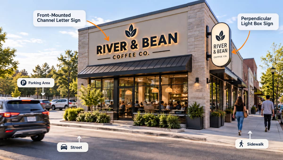
Start by thinking about where customers will be when they first notice your storefront.
Both channel letters and LED light boxes can work well as freestanding signs, with dimensions adjusted to suit the location and viewing distance. But each style also has advantages in certain settings.
Imagine walking through a busy downtown district or outdoor mall, passing one business after another. Signs mounted flat against buildings can look great from across the street, but they’re not always easy to see when approaching from the side.
This is where pill-shaped LED signage can be particularly valuable for establishments that rely on foot traffic. Mounted perpendicular to a building or interior wall, they can extend outward, making them easier to spot from either direction.
Channel letter signs, meanwhile, are frequently installed directly on a building’s façade, providing prominent identification for drivers and pedestrians approaching from the front.
Of course, neither mounting style is exclusive to one option. What matters most is how it will be seen from the street, sidewalk, or parking area.
Ultimately, a large storefront along a busy roadway has different needs than a small diner in a walkable neighborhood.
Messaging: What Does Your Sign Say About Your Business?
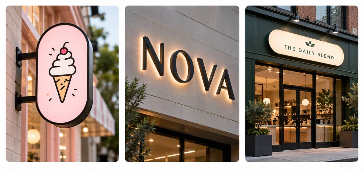
Every sign communicates something about the business behind it, whether intentional or not.
It can convey professionalism, tradition, or a more playful personality. Think about a law office, a neighborhood bakery, and a children’s entertainment center. Chances are, the signage that suits one wouldn’t be the best fit for another.
Ideally, the design should also coordinate with the company’s website, social media, and other marketing materials to achieve a familiar look across different channels.
The goal isn’t necessarily to choose the trendiest or most elaborate design. It’s to create something that feels appropriate for the business, connects with its audience, and makes a positive impression before anyone walks through the door.
Readability: Can It Be Fully Taken In?
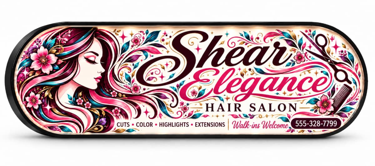
How quickly will someone be able to recognize and read your sign while walking past, driving down the street, or pulling into a parking lot? And how far away will they be when they first notice it?
A design might look fantastic on a computer screen, but that doesn’t necessarily mean it will be easy to make out from afar.
Letter size, contrast, font style, and spacing all affect legibility, as does illumination, especially after sunset. A flower shop that’s open from 9 a.m. to 5 p.m. may have different lighting needs than a 24-hour convenience store.
Highly decorative lettering, intricate logos, or too many graphic elements can make a sign difficult to decipher from a distance. What looks impressive up close may lose its impact farther away. For instance, a crowded light box or poorly spaced channel letters can make an otherwise attractive design harder to understand at a glance.
Remember, a sign doesn’t need to tell the whole story. It just needs to capture attention, communicate clearly, and help people remember the business.
Functionality: What Makes the Most Sense?
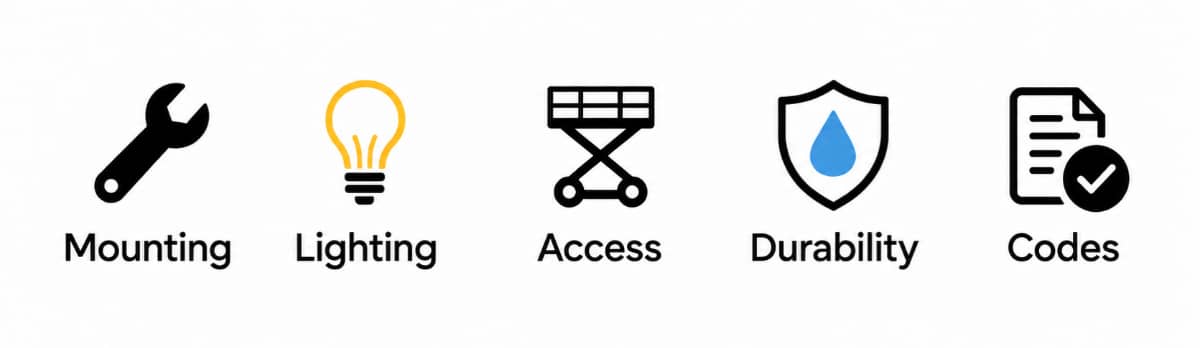
Before getting too far into the creative process, it’s worth taking a closer look at installation requirements, ongoing maintenance, and any property restrictions that may apply. While these details aren’t as exciting as choosing colors and lettering, addressing them early can save time and prevent unexpected changes.
How much space is available for the sign? What type of surface will support the sign, and can it accommodate the weight and mounting hardware?
Existing architectural features, including brick or stone accents, metal panels, and windows, can also influence placement and the finished appearance.
Both channel letters and light boxes can use energy-efficient LED illumination. Beyond that, upkeep and long-term costs vary depending on the materials, construction, and mounting method.
Many light boxes allow for replacement sign faces, making future updates easier. Similarly, individual channel letter signs can sometimes be repaired or replaced without having to install an entirely new display.
Access for repairs is another consideration, particularly for signs mounted high on a building. Asking about durability, serviceability, and expected maintenance can give you a clearer picture of what ownership will involve.
Property restrictions also come into play. Shopping centers, historic districts, and municipalities may have specific requirements regarding sign dimensions, mounting methods, or illumination.
Make Your Business Easy to Find and Remember
A well-chosen sign does more than attract attention. Over time, it becomes a familiar landmark that customers associate with your business.
Whether you’re drawn to the dimensional appearance of channel letter signs or the rounded profile of pill-shaped LED light boxes, the right choice depends on your location, surroundings, and the impression you want to make.
At Hall of Fame Plaques & Signs, we help businesses find the right balance between visual appeal and everyday practicality. Because great signage isn’t always about making the loudest statement. It’s about making the right one.
Explore our custom commercial signage options or contact us to discuss a solution that fits your space and gets noticed.